Lu Xing
Sunday, 30 June 2013
Tuesday, 25 June 2013
Final of Exp3
The landscape I chosed is Tianchi from China. It is a dead vocano and has a lake on the top of the hill.
Texture
Liner Rotational Scalar Eco Flow Wind
Photos
The overall view of the school
The opposite side of the bridge
The overall idea of this school is about eco-friendly. Form my point of view, eco-friendly can be seen as a kind of transforming. So, basically, I changed the shape and used materials look like tinber. The texture and color is suitable for the landscape. The landscape is a simple that can not see many vagetables and rockss. I tried to change this situation by my school-bridge. The overall shape of it is flowing and transforming.
This school has four major part.
The gallery with stairs that can enjoy te view of the valley.
The studio and lecture room on the first floor. the library and work shop on the second floor. The computer labs on the third floor. And the design of this can make communication between outside and inside. Also this design keeps privacy to each room too.
The ground floor for research space.
Elevator for students
Folly space
The elevator for teachers

Monday, 3 June 2013
Friday, 17 May 2013
Sunday, 5 May 2013
Exp2 Final Post
This experiment is about two master of architects--Frank Lloyd Wright and Aries Mateus. At the first, direct feeling to their work is about simple geometric shapes form elegant complex.
2 concepts
Uniformity of simple spaces
Domination of geometric models
First of all, Wright is a outstanding master of modern architectural area. Many wonderful master pieces of him show different ideal about environment and building. He usually use simple geometric shape or even outlook to explain complex residence.
Mateus is a Spanish architect and his work is full of joy and weightless.
Both of them prefer simple geometric shape and use them in an elegant way.
Texture
I am trying to present a style of transform of simple shape and evoking feeling of growing in my
texture. Landscape
Both of these two architects are showing organic ideal ahout building in the furture progress. So I think even in the very bad situation, they can bring their decent and elegnat style building to people. Then I thought the differnence between architecture and landscape can produce quite impressive contrast.
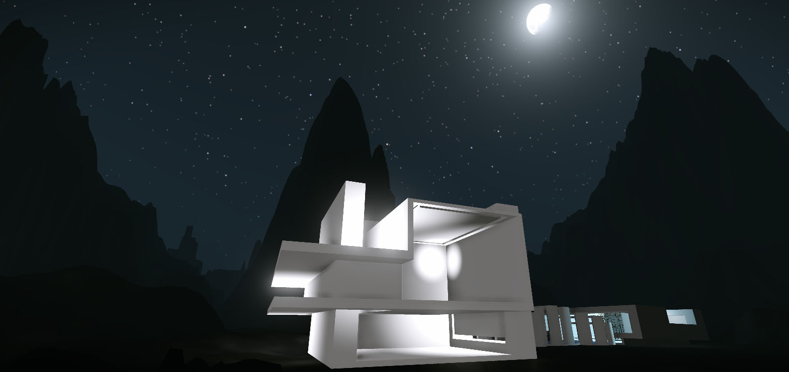
Cry Engine Models
Overall look
Part 1 of monument
Within the monument , celling with simple shape show the beautiful star sky!
Part 2 of monument
This indoor garden is my favorite!
Link with my Cry Engine
https://docs.google.com/file/d/0B3U0UQqSkib7cnhpZ0pzRG51aEU/edit?usp=sharing
Monday, 29 April 2013
Subscribe to:
Comments (Atom)


